
Graphics and Plots in Science
Graphics and visualizations are used for promotion, advertisement to promote a product or idea. In science, graphics tend to fall into one of two categories: for use in education or a science journal. For information on what makes a good educational graphic, or a teaching tool, I’ve written a piece earlier on this blog here. In the academic articles, graphics hold a special role in telling a compelling story of the data and results, however, the editing emphasis is often placed much more on text than making interesting and understandable science graphics.
DISCLAIMER: I am coming from an astronomy and physics background, and am going to discuss problems found within these contexts.
###Academic Article Graphics
We think of academics and especially science as being told through plots and graphs. In fact, Tufte explains that the history graphics begins with time series plots of the planets and the sun in the night sky. Now a days, science articles use graphics to tell a story. We let the data speak for itself by representing it in a reproducible graphic.
In my time in academia (in physics and astronomy) I’ve come across several common problems such as:
- Missing or incorrect error bars (especially on log-log plots)
- Missing or incorrect ticks marks and axis labels
- Too much text - Keep notes and explanations outside the graphic and in the image caption
- Overlap of lines or points
- Wasting space or not using enough of it
- Plots that should have been tables
Some of these problems come from trying to show off too much of the data. You want the data to stand out, but you don’t always need to include all of it. This is hard because we spend so much time working with the data that we want to share everything, but the added complexity often takes away from the graph and the point you’re trying to make.
In the remainder of the blog, I will try to address each of these points and introduce a fast and easy way to correct them.
####Corrections to common problem with academic graphics:
- Log-log plots with missing or symmetric error bars can be fixed by forcing asymmetric error bars. When there are small errors, the log can show as a negative error, which often means that plot won’t do anything. In Matplotlib the default (for the y axis) is to map all negative values a very small positive one. The code for that is:
plt.yscale('log', nonposx='clip') - Tick marks: The defaults for tick marks and labels are often too large, too small, facing the wrong direction or else wise strange. In ggplot in R this can be manipulated under theme:
For example, to make everything expect your points or lines disappear you’d use:
 theme(axis.line=element_blank(),
        axis.text.x=element_blank(),
        axis.text.y=element_blank(),
        axis.ticks=element_blank(),
        axis.title.x=element_blank(),
        axis.title.y=element_blank(),
        legend.position="none",
        panel.background=element_blank(),
        panel.border=element_blank(),
        panel.grid.major=element_blank(),
        panel.grid.minor=element_blank(),
        plot.background=element_blank())
Each of these could also be modified to make the text larger or smaller, change the font, rotate the labels…etc.
To change the direction and size of the tick labels you’d use something like:
theme(axis.text.x = element_text(angle=90, vjust=0.5, size=16)
-
You can reduce clutter on the graph by using fewer (labeled) tick marks.
-
Always remember to label your axes! This is done in python with:
import matplotlib.pyplot as plt
plt.xlabel('X Label')
plt.ylabel('Y Label')
or in ggplot2 in R using:
  labs(title = "Plot Title") +
  ylab("X Label") +
  xlab("Y Label")
- The problem of too many overlapping lines or points can be solved in various ways depending on the data. Sometimes, changing the colors and alpha of the points might be enough. In other cases, it’s best to separate out the information into a table of plots.
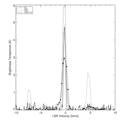
For example, below is the original plot from my research showing the intensity of different molecules across velocities. The plot places all four molecules on the same graph with a key indicating which is which. In color, this graphic might make more sense, but it is still hard to make out the individual curves. Plus, the key is small and referring back to it is time consuming and annoying.
In fixing the graphic, while also including more information from my other sources, I separated out the each of the molecules and sources into a table of spectra. This un-clutters the plot and allows you to more easily visualize trends in the sources. (Notice how the plot is missing axes labels - shame on me!)
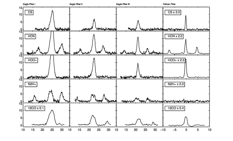
The code for this plot was done in IDL - a language mostly used only by astronomers (after looking at the code, you’ll see why no one else joined in the fun…) If you’re interested, you can check it out here.
For the future, I want to try and remake some of my research plots in R for better practice with R and ggplot2, using something along these lines:
data %>%
ggplot(aes(x=vel,y=tb)) +
geom_line() +
facet_wrap(~pillar)
- In attempts to not waste space, you should examine the size and scale of the axes. This often shows up as a problem when an outlier or two that expand the axes such that much of the plot is empty. In these cases, you can crop the plot to the main data and include an arrow to show where the outlier is.
Most importantly, don’t display empty plots like this infamous plot from Wittke-Thompson JK and Pluzhnikov A, Cox NJ (2005).
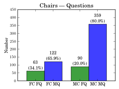
- Sometimes, to save room or otherwise, it’s best to display the information in a table format instead of bar graphs. For example, this plot from a science article titled “Studying Gender in Conference Talks – data from the 223rd meeting of the American Astronomical Society” shows the large difference in number questions asked by males vs number asked by females, given a male or female chair. This plot displays the most significant finding from the analysis: a strong dependence on session chair gender. Still, this information could have easily been shown in a table instead of a graph. This would be a useful plot for a presentation on the subject, but not needed in the article.
###Color in academic graphics:
Color can be a huge issue in scientific articles. This is largely because most journals charge more for printing in color, but will present colored versions of plots in the online versions on the articles. This means that authors need to make sure that they have plots that work well in color and in black and white, which gives way to some graphics which are very hard to read.
####Common color problems.
- Eye piercing bight colors and/or use of rainbow colors. We’ve discussed the problems with the rainbow in class, but as a reminder: the rainbow color scheme includes colors which are hard to see, doesn’t have a universally understood order, artificially exaggerates differences in color while softening the differences between others and (importantly for print) doesn’t convert well to black and white.
Contrast is one of THE biggest problems I see in academic figures. Things like cyan or yellow on white, red on blue, navy on black… these cause major problems (and headaches) when reading text or trying to discern between lines. Your plot doesn’t have to be pretty, but it does have to be legible!
Color in astronomy maps often tags along with Color-coded image of the molecular cloud
###Graph Critique and Fix
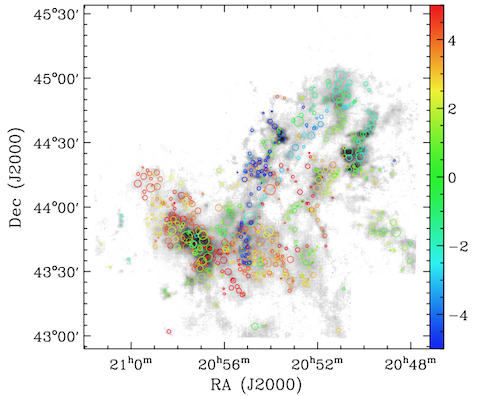
The image from an article titled “MOLECULAR CLOUDS IN THE NORTH AMERICAN AND PELICAN NEBULAE: STRUCTURES” by Shaobo Zhang, Ye Xu and Ji Yang, displays the locations of clumps, as well as their velocity and size. From the image caption “The circles indicate the clump positions on the integrated intensity map of 13 CO. The colors of the circles represent the velocities the clumps, while the circles are scaled according to the sizes of clumps.”
This is a perfect example of trying to show too much in one plot such that it’s no longer understandable. A different color scheme would help the eye more easily see the trends in velocity. I would also like to see the circles filled in, and the background map a bit darker. Also, The graph extends too far up so that the color legend is clear, but leaves too much empty space in the graph. The axes and tick marks could also be smaller.
I didn’t have their data, but I remade a similar type of plot pulling points, velocities and sizes from normal distributions (see code below).
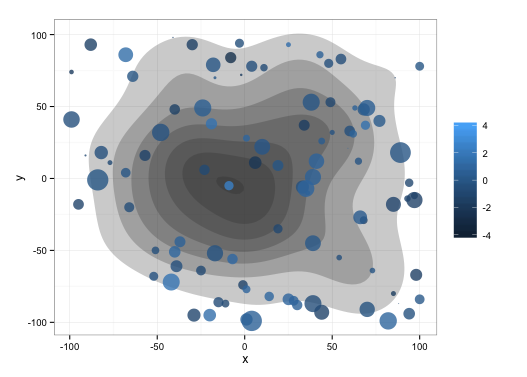
This image fixes some of the problem by using GGPLOT default color scheme, which keeps the hue in blue and changes the brightness. I’ve filled in the circle in make the difference in sizes more clear, and I made sure that the circles are scaled by area, as to not conflate radius and area.
library(ggplot2)

xvar <- sample(-100:100,100,replace=T)
yvar <- sample(-100:100,100,replace=T)
v <-  sort(rnorm(100,0,1))
s <- abs(rnorm(100))

data <- data.frame(xvar,yvar,v,s)
data <- data[order(data$v),]
data$x <- rnorm(100,0,50)
data$y <- rnorm(100,0,50)

ggplot(data,aes(x=x,y=y), legend=FALSE)+
  stat_density2d(aes(alpha=..level..), geom="polygon", show_guide=FALSE) +
  scale_alpha_continuous(limits=c(-2,10), breaks=seq(0,1,by=1)) +
  geom_point(aes(x=xvar, y=yvar, size=s, color=v), alpha=0.8, show_guide=FALSE) +
  scale_colour_gradient(limits=c(-4,4)) +
  scale_size_area(max_size=10)   +
  theme_bw() +
  theme(legend.title=element_blank())
###Conclusions:
- Always remember to think about the story your telling and how your graphic fits in.
- Label your plots correctly, but don’t clog the plot with text. Keep your labels short, and rotate them if needed to to be read.
- If displaying all of your data looks cluttered, think about if you really need to show all of it, and if so if there’s a better way to display it.
- Watch out for color! We like pretty graphs, but only if we can still read them.